


Double page spread layouts designed entirely by me in Adobe InDesign as part of a university project. As well as arranging the spreads I also wrote the text myself and took the photos and edited them myself for the designs.
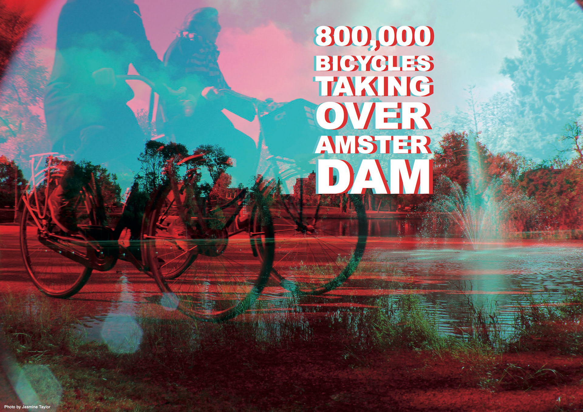
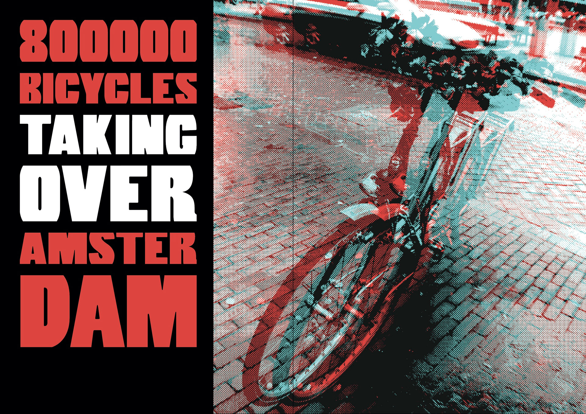
The first design uses the first dps to capture the attention of the audience before turning to the next page where the text is. I used red and blue as the main colours for this design and ensured this carried over onto both pages.
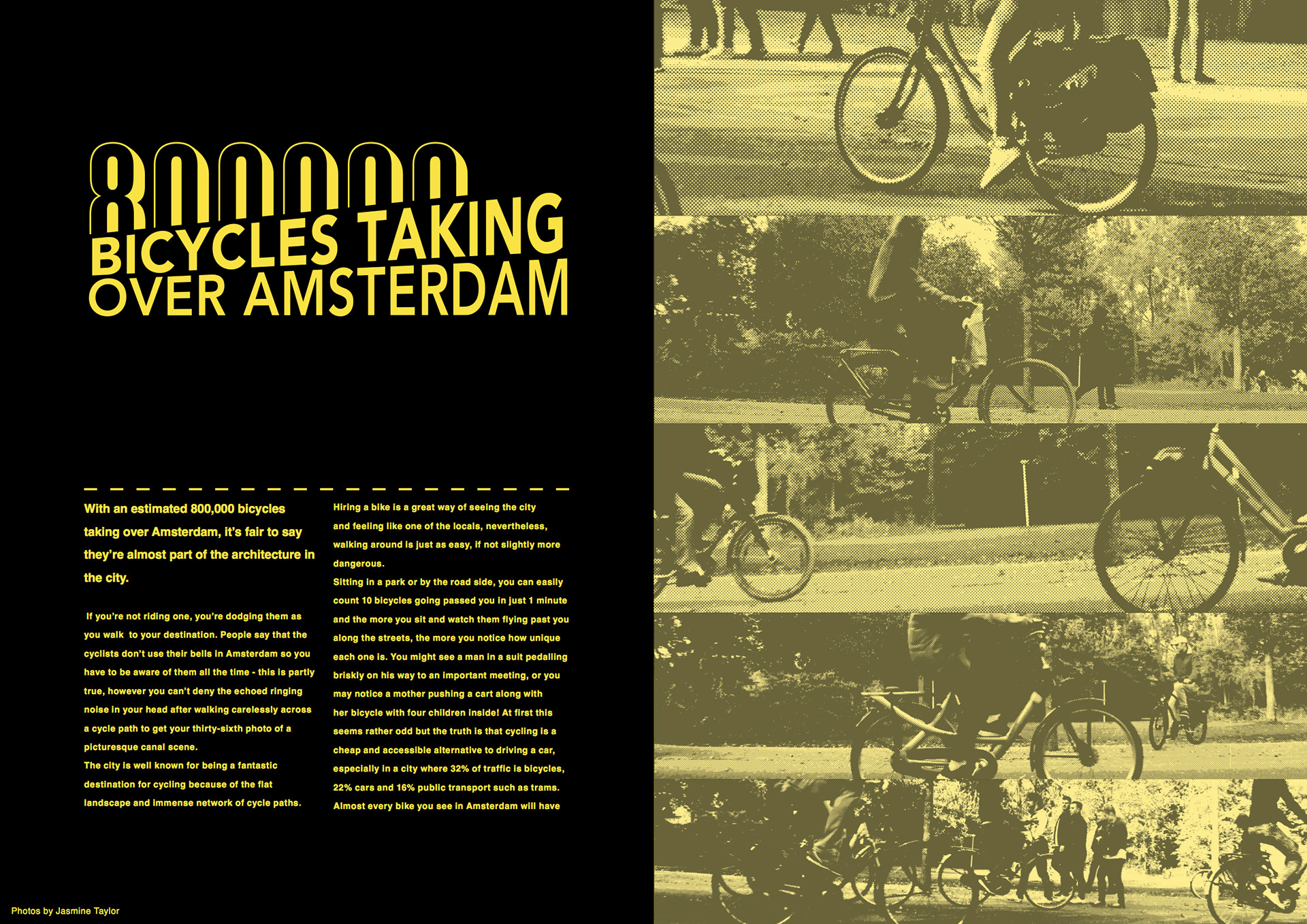
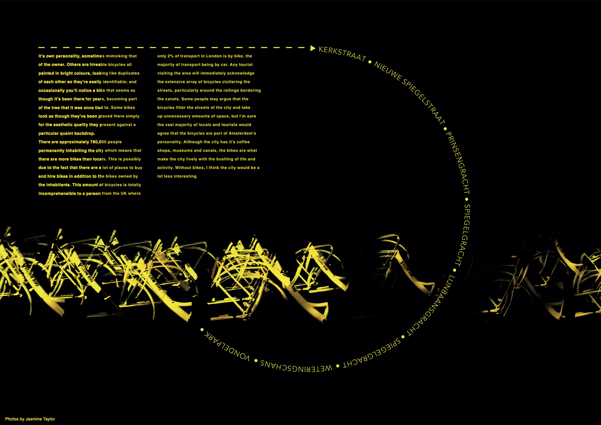
The second set of double page spreads were more interesting to create. I wanted to base the colours on the bikes that I saw in Amsterdam, particularly the yellow bikes which were available to hire for touring the city. The brief said we had to include a wayfinding device such as a map. So for this design I created a wayfinding device using the names of streets in the city to direct the audience to a location.
The third design is an alternative of the first, using similar colours and styles but a different layout with different images, typography and a wayfinding device.
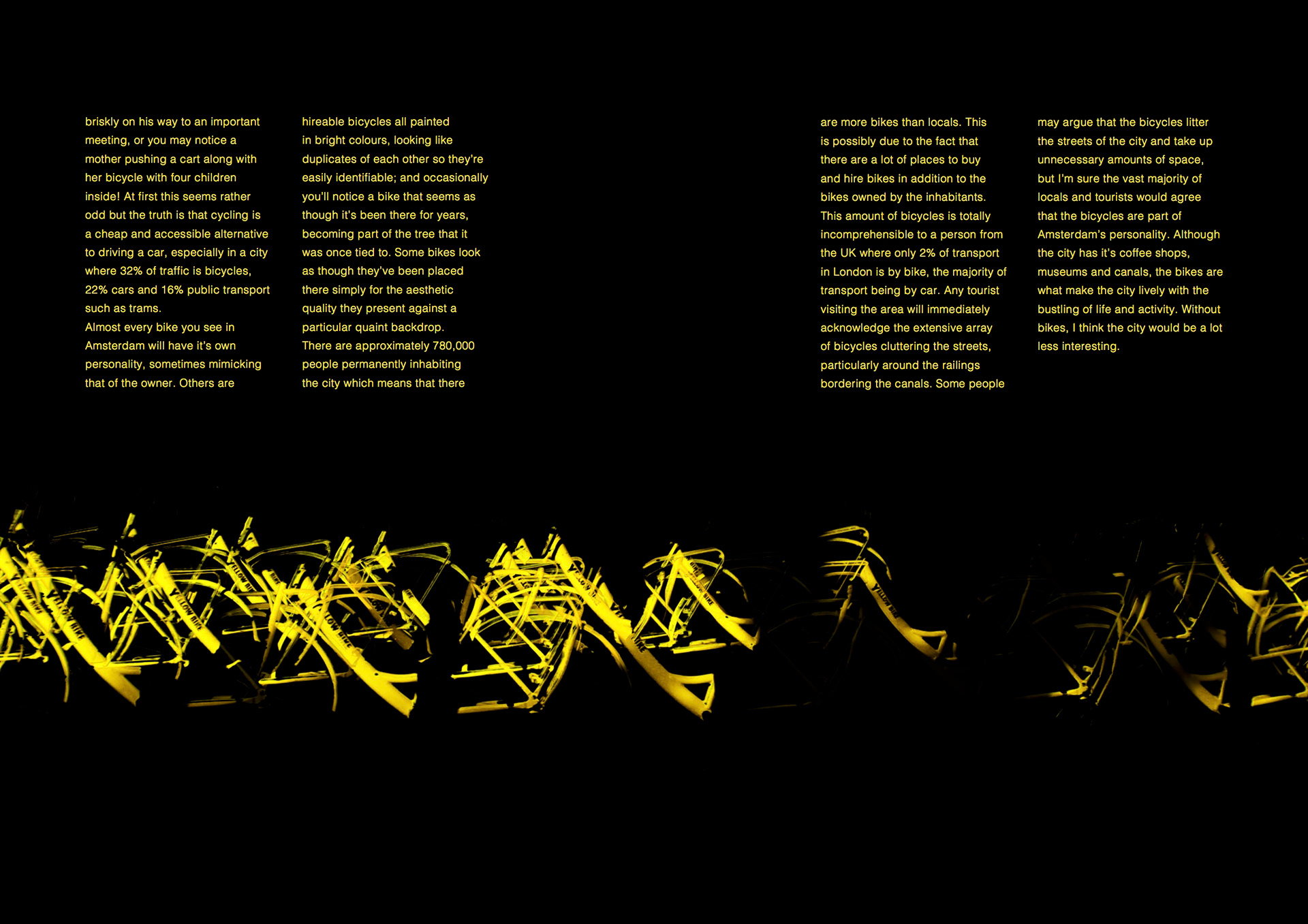
The fourth is another design similar to the second set of spreads. I didn't like this design as much as the first one I did based on the yellow bikes but I did like the style I used with the dot screen effect and the typography.